





Why Most NetSuite Dashboards Quietly Fail (And What Mature Teams Do Differently)
By: soolengMost NetSuite dashboards drift from decision-support tool to wallpaper within a quarter. The difference between dashboards that get used and dashboards that get ignored is not the portlet count – it is the operating model behind them.
Real-time visibility is the promise. Sustained adoption is the greater challenge.
The uncomfortable pattern
Across many NetSuite environments, a similar pattern emerges within the first year after go-live. A small group of users continue relying on dashboards every day, while others gradually return to exporting data into spreadsheets. Meetings become focused on reconciling conflicting reports rather than discussing actions, and adoption declines despite the addition of new KPIs and reporting components.
In many cases, technology is not the constraint. The dashboard was treated as a project deliverable rather than an operational product that evolves alongside the business.
The organizations that sustain dashboard adoption do something different. They treat dashboards as an operating layer over the ERP—something that evolves alongside the business rather than something completed during implementation.
The Four stages of dashboard maturity
Stage 1 – Cosmetic
Every role sees the home page that the implementation partner published. KPIs are the standard ones – sales orders, A/R aging, open cases – and almost none of them are tied to a decision the viewer can act on today. Usage is high at go-live and decays month over month.
Stage 2 – Personal
Power users start personalizing. Each builds their own saved searches, layouts, and reminders. Insight improves locally, but the organization loses any common operating picture – two managers in the same function now compare different numbers in the same meeting.
Stage 3 – Role-aligned
Someone (often the controller or NetSuite admin) takes ownership. Dashboards are republished by role with a shared definition of what the role needs to see daily, weekly, and monthly. The personalization layer stays, but a baseline exists. This is the stage at which many successful NetSuite environments operate.
Stage 4 – Decision-aligned
The highest level of dashboard maturity is achieved when dashboards are organized around the decisions a role is expected to make rather than the data a function happens to generate. KPIs answer specific questions (“Do we need to expedite freight this week?”), reminders surface the exceptions that require human judgment, and workbooks supply the diagnostic depth when a KPI moves. Adoption tends to remain strong because the dashboard becomes embedded in day-to-day decision-making rather than functioning solely as a reporting mechanism
The most effective KPIs answer questions that users are expected to ask as part of their role and decision-making responsibilities.
Three operating principles that separate Stage 4 from the rest
1. Tie every portlet to a named decision
Before a portlet is added, write down the decision it informs and the person accountable for that decision. If you cannot complete the sentence “This portlet helps [role] decide [action] by [cadence],” the portlet should not ship. This discipline significantly reduces unnecessary dashboard complexity and encourages a stronger connection between information and action.
2. Treat the dashboard as a product, with an owner and a backlog
Decisions evolve. New product lines, new entities, new compliance regimes all change the questions the business asks. Mature teams assign an owner per role-based dashboard, maintain a small backlog of requested changes, and review it on a fixed cadence. Dashboards without an owner inevitably lose relevance over time. This is not unique to NetSuite; it is a common characteristic of reporting environments across platforms.
3. Govern KPIs centrally, even when you allow personalization
Shared KPIs—cash position, gross margin, revenue, and receivables—need one definition, one filter set, and one source of truth. Personal dashboard layouts and portlets can vary by role, but the underlying metrics should be governed centrally. NetSuite KPI scorecards, trend graphs, and shared reporting provide a consistent view of performance, allowing teams to focus on decisions rather than reconciling different versions of the numbers.
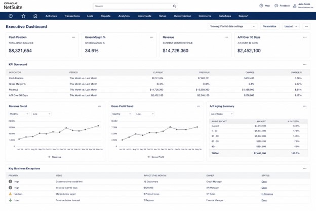
The executive dashboard is organized around four business priorities—cash, margin, growth, and collections—using KPI scorecards, trend analysis, and exception reporting rather than departmental reporting.
Where teams typically get it wrong
- Treating SuiteAnalytics workbooks as a replacement for governance. Workbooks expand the analytical surface area; they do not solve the question of who owns each metric definition.
- Confusing density with value. A page with twelve KPIs and four trend graphs reads as effort but rarely changes behaviour. A smaller set of highly relevant KPIs is typically more effective than a larger collection of generic metrics.
- Letting reminders become noise. Reminders are the most powerful and most abused portlet – if a user dismisses them habitually, they have stopped working. Audit them quarterly.
- Skipping the conversation about exceptions. KPIs tell you where you stand; exception lists tell you what to do. Stage 4 dashboards always pair the two.
A Simple Dashboard Effectiveness Assessment
A useful assessment can be performed with a small sample of business users.
Select three roles that should rely heavily on NetSuite dashboards and ask each user to describe the decisions they made during the previous business week. Then ask which dashboard components informed those decisions.
If the user cannot identify the supporting dashboard elements—or if critical analysis was performed outside NetSuite—the dashboard may not be providing sufficient operational value regardless of how comprehensive it appears.
Ultimately, the value of a dashboard is determined less by its technical components and more by the quality of the conversations, decisions, and actions it supports. KPI scorecards, workbook embeds, and saved searches are important tools, but they are most effective when aligned to a clearly defined operating model.
Frequently asked questions
How many KPIs should a NetSuite dashboard show?
Aim for the smallest number that supports the role’s recurring decisions – typically five to seven. NetSuite caps KPI tiles per row at five for a reason: more than that and the eye stops scanning.
Should every user personalize their own dashboard?
No. Publish a governed baseline per role, then allow personal portlets on top. Personalization without a baseline produces inconsistency; baseline without personalization produces irrelevance.
When should we use SuiteAnalytics workbooks instead of saved-search KPIs?
Workbooks earn their place when a metric needs multi-dimensional analysis (pivot, drill, comparison across periods) rather than a single summary value. For a tile or a trend line, a saved-search KPI is usually faster to build and easier to govern.
How often should dashboards be reviewed?
Quarterly is the minimum. Set a recurring 30-minute review per role with the dashboard owner and one or two power users to retire stale portlets and capture new requests.
The takeaway
NetSuite ships with the components for an excellent operational cockpit. Most organizations get the components and miss the cockpit because they treat dashboards as a configuration task rather than a product with an owner, a backlog, and a clear connection to decisions. The technology is not the constraint. The operating model is.
Organizations that sustain dashboard adoption typically focus less on the dashboard itself and more on the quality of the decisions, actions, and accountability structures that surround it.